
If you write Angular apps you spent a lot of your time making decisions for your users.
You decide what they will see, and when.
You decide how the app responds to their interactions.
I often struggle knowing which is the right decision.
- Do I put this widget on the left or the right?
- Do I only show one at a time, or multiple?
- Do I separate things into different sections or have a long page where it’s all available at once?
Like most developers, I spend time seeing what others are doing and try to cherry-pick the good stuff. What follows are some resources that I’ve come across that really help me make better decisions.
Better decisions mean by application functions better for my users. It also means it’s easier to understand, which means less support calls for our Help Desk (yay!).
I’m not perfect, of course. I still make wrong decisions. But I think I make them less! And hopefully these resources help you to make better design and user experience decisions when you create Angular apps.
User Onboarding
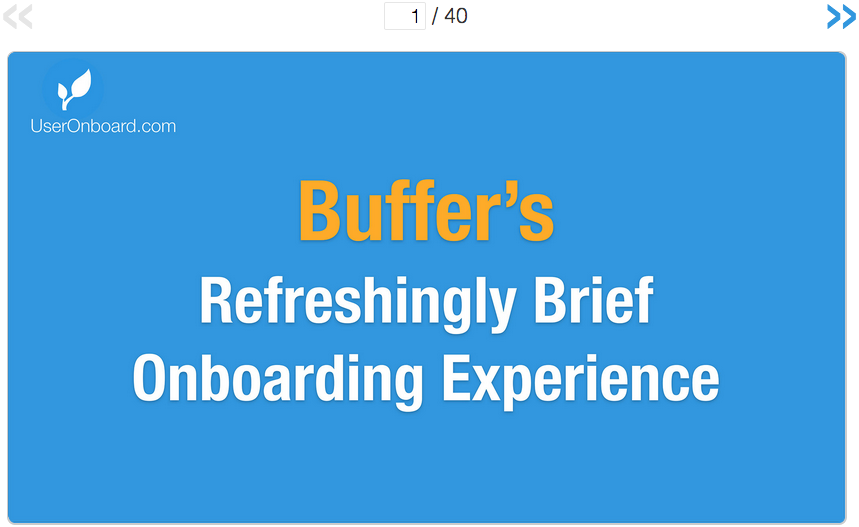 Samuel Huelick’s User Onboarding takes you into the guts of how
other apps and sites treat new users.
Samuel Huelick’s User Onboarding takes you into the guts of how
other apps and sites treat new users.
Sam takes a given site or application and deconstructs their “onboarding” process into steps. Each step has a screenshot that he annotates with what’s good, what’s bad, and suggestions for improvement.
This is insanely useful where you’re creating new Angular apps, or upgrading old ones. You can learn loads from the mistakes that others have made, and from their successes as well. Sam does a great job of extracting those mistakes and successes, and processing them for you.
There’s a lot to absorb here, so I suggest you pick a couple that sound interesting and take notes. My favorites so far are:
Don’t Make Me Think
 Don’t Make Me Think by Steve Krug is a modern classic. Classic in the sense
that the original version is 15 years old, and it’s still perfectly relevant today.
Don’t Make Me Think by Steve Krug is a modern classic. Classic in the sense
that the original version is 15 years old, and it’s still perfectly relevant today.
Steve’s overarching principle, what he calls the First Principle of Web Usability, is this:
Your user shouldn’t have to think when they land in your app.
The user’s next step should be self-evident.
Imagine the most technologically helpless person you know, and they’re using an Angular app you wrote. If you give them a simple task, will they know what to do? Yea, my users wouldn’t either.
And you know what? That’s really difficult. And it takes time. I’m not saying that you need to dumb everything down and cater to the lowest common denominator if you’re writing tools for software engineers, but here’s the thing:
Less decisions mean less mistakes.
The fewer choices you allow your user to make, the less likely they are to choose the wrong one. I’ve seen this time and time again in our business.
We unfortunately rely on many 3rd-party applications which give far too many options. We only want one type of exported file. The app allows 6. How many different types do you think we have sent in?
Yea, you got it.
Reduce decisions. Don’t make your users think. They’ll thank you and you’ll thank yourself.
Badass: Making Users Awesome
 Kathy Sierra’s book, Badass: Making Users Awesome, was pure enlightenment
for me. It reframed how I think, at a core level:
Kathy Sierra’s book, Badass: Making Users Awesome, was pure enlightenment
for me. It reframed how I think, at a core level:
- What does my user really care about doing, and becoming? Kathy calls this their compelling context.
- If I’m working on a business app, how does the app help my users achieve their compelling context?
- What concepts does my user need to know, and what I can cut?
- When do I introduce things so that I don’t overwhelm, bore, or alienate my users?
Even though a lot of my time is spent creating line-of-business apps, I still found this book incredibly relevant.
At our business we have several applications being used by employees you could lovingly refer to as “low-tech”. By that I mean that email is a new concept for them.
That’s not necessarily a bad thing, but it’s a hurdle for an application developer. How do I need to design, structure, and teach the applications I write so that I don’t frustrate my users, and don’t frustrate myself by watching them struggle?
My users don’t really care about being “good” at using my apps. They want to be “good” at their jobs. They want to advance. and grow (most of them anyway…).
The best thing I can do is create apps that meet them where they’re at. That makes the app more useful to them, and it reflects better on me.
What about you? Can you take what Kathy teaches and significantly improve your applications, while helping your users? I think so. Absolutely.
GoodUI
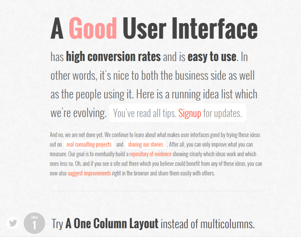
This site, from Jakub Linowski, is a running list of suggestions to make UIs easier to use. It also focuses on conversion rates. That may or may not apply to what your’re creating. If not, there’s still lots of great tactics that you should note. Even better, add them to a Best Practices notebook. You have one of those, right?
Each suggestion has an example sketch of what it looks like to follow and not follow it. This demonstration makes it easy to skim and absorb the suggestions quickly. There’s a text explanation for each of them, but most can be understood just by the examples.
Honestly a lot of these tips should be Common Sense. But I think that I could take almost every suggestion and find a project where I’ve gone the other way.
Has that ever been the right choice? Probably not.
Some tips that I have found helpful:
- Show options (maybe as buttons?) rather than hiding them in a drop-down
- Design for no data rather than data-heavy cases
- Inline validation rather than delaying errors
- Give icons labels rather than leaving them open to interpretation
Summary
Those are your four resources, Mr or Mrs (or Ms!) Angular developer. You might be asking yourself:
Why only four…?
Here’s the answer:
There’s so much content in all of these that more would be superfluous.
I’ve gone through each of these resources in depth, and I find myself going back to them time and time again.
My brain needs to refresh. I need to continue building patterns, and remembering the things that are going to help my users the most.
 My suggestion to you is to start diving in.
Take notes (yes, get a pen or file up the ol’ text editor) of what you can apply right now in the Angular applications that you’re writing.
That’s going to have the largest impact on your, and your users.
Happy learning!
Interested in what I personally found most helpful? Check out my 20 UX Resource Take-Aways download below. Enter your email address and I’ll send you a link to my Bonus Content area where you can find this and other helpful resources.
I hate spam. I’ll never send you anything I don’t think is extremely helpful.
![]()
Have a suggestion, question, or comment about the resources above, or on writing Angular applications with your users in mind? Leave a comment below ↓