Dropdown-type widgets abound in the web development space.
No matter what you call them: combobox, select box, multi-select, they all accomplish basically the same thing: selecting one or more items from many.
Sure, a lot of them have extra bells and whistles like type-ahead, sorting, custom display, etc., but with all the extra comes extra pain.
You’ll find that pretty much none of the commonly-used dropdown tools have compatible APIs. Some have events they fire, some don’t. Some will let you extend them easily, others are very constrained.
When you combine all the different options out there with a need to put a dropdown in UI-Grid, the pain multiplies:
How do I get the dropdown to display right in the grid? How do I hook the dropdown up to my data?
And what if I spend a ton of time on this and it ends up not working?
I want to give you a quick fix that will work for a good number of your use cases.
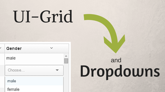
In this post you’ll find a working example for using one of the popular dropdown widgets: UI-Select.
Why UI-Select?
Why use this one of all of the others? The short answer is that it can attach to the document body, rather than just inside its parent element. UI-Grid has to prevent visible overflow in a lot of places, which means that widgets that show potentially long lists (which dropdowns can do) can get cut off.
Placing the widget’s contents outside of the grid avoids that problem completely.
OK, So How Do I Use It?
We’ll cover a short series of steps to getting UI-Select working in our grid. For our example, we will have a bunch of data where each row is a user with a gender. When editing the gender we want to be able to select an option from a dropdown.
Here’s our steps:
- Set up the grid for editing
- Create a edit template for UI-Select, hooking it up to our grid rows
- Wrap our UI-Select template so we can handle events like hiding it when we click elsewhere on the grid or document
1. Grid Setup
Here’s what our grid options look like:
|
1
2
3
4
5
6
7
8
9
10
11
12
13
14
15
16
|
$scope.gridOptions
= {
rowHeight:
38,
columnDefs:
[
{ name:
'name' },
{ name:
'age', type: 'number' },
{
name:
'gender',
editableCellTemplate: 'uiSelect.html',
editDropdownOptionsArray: [
'male',
'female',
'other'
]
}
]
};
|
In our gender column we specify a editDropdownOptionsArray option. This is
normally used by the built-in HTML select box option, but we’ll re-purpose it for our custom
dropdown. The values are simply the different genders we can choose.
You’re also not limited to a basic array of strings; your dropdown options could be complex objects as well:
|
1
2
3
4
5
|
editDropdownOptionsArray: [
{ id: 0,
value: 'male'
},
{ id: 1,
value: 'female'
},
{ id: 2,
value: 'other
}
]
|
You’d just need to make sure you bind to the right property to display the value.
Row Height
You’ll also notice that we set a custom rowHeight. This lets the dropdown widget fit
nicely in our row without overlapping any of the borders. You could always resize it with CSS if you
wanted to but this serves our purposes.
2. Edit Template
This is our editable cell template. We are using the “selectize” theme. UI-Select offers others but this one is nice and clean.
|
1
2
3
4
5
6
7
8
|
<ui-select ng-model="MODEL_COL_FIELD" theme="selectize"
append-to-body="true">
<ui-select-match
placeholder="Choose...">{{ COL_FIELD }}</ui-select-match>
<ui-select-choices
repeat="item in col.colDef.editDropdownOptionsArray | filter:
$select.search">
<span>{{ item }}</span>
</ui-select-choices>
</ui-select>
|
Note the append-to-body="true". That’s the trick to making the dropdown display
right.
You’ll also see that we use two placeholders in our template: MODEL_COL_FIELD and
COL_FIELD. The first one is used to bind the dropdown to the right property in our row
entity.
The second is used to display the initial selected value in the dropdown when we double-click to edit.
We access the dropdown options we defined above by using the column’s column definition:
col.colDef.editDropdownOptionsArray.
3. Wrap the Template
This template would work, but it’s got one problem: it won’t disappear when we click elsewhere on the page. The dropdown doesn’t know it’s supposed to hide when we want to interact with other elements.
We can fix this by wrapping the UI-Select directive in a custom directive where we’ll
add some event bindings. We’ll call the directive ui-select-wrap and it will look a
little something like this:
|
1
2
3
4
5
6
7
8
9
10
11
12
13
|
uiSelectWrap.$inject
= ['$document', 'uiGridEditConstants'];
function uiSelectWrap($document, uiGridEditConstants) {
return function
link($scope, $elm, $attr) {
$document.on('click',
docClick);
function docClick(evt)
{
if ($(evt.target).closest('.ui-select-container').size()
=== 0)
{
$scope.$emit(uiGridEditConstants.events.END_CELL_EDIT);
$document.off('click', docClick);
}
}
};
}
|
What we’re looking for here is catching any clicks on the entire document that don’t fall without the container that holds our active UI-Select element. We do this by attaching a click handler to $document (which is just an Angular wrapper around the standard document object).
We use jQuery’s closest() method to see if the
click target has a .ui-select-container ancestor. If we didn’t want jQuery as a
dependency we could also do this using the gridUtil service’s closestElm method like
so: gridUtil.closestElm(evt.target, '.ui-select-container');
If the click isn’t on the UI-Select widget we fire END_CELL_EDIT and detach
our click handler. Done!
Example
Here’s a plunker demonstrating the code we wrote above. You can double-click on the gender fields to show the dropdown.
What About Other Widgets?
Like we said above, there’s many many other dropdown widgets out there. Just to name a few:
There may be ways to get these working but you have to ask the question: “Will these attach to the document body?” If not, you’ll be fighting with getting the dropdown to display outside the grid and that’s no fun.
If you have any questions about getting UI-Select to work in your grid, or if you want to explore using other widgets in UI-Grid, leave me a message in the comments. I respond to all of them!