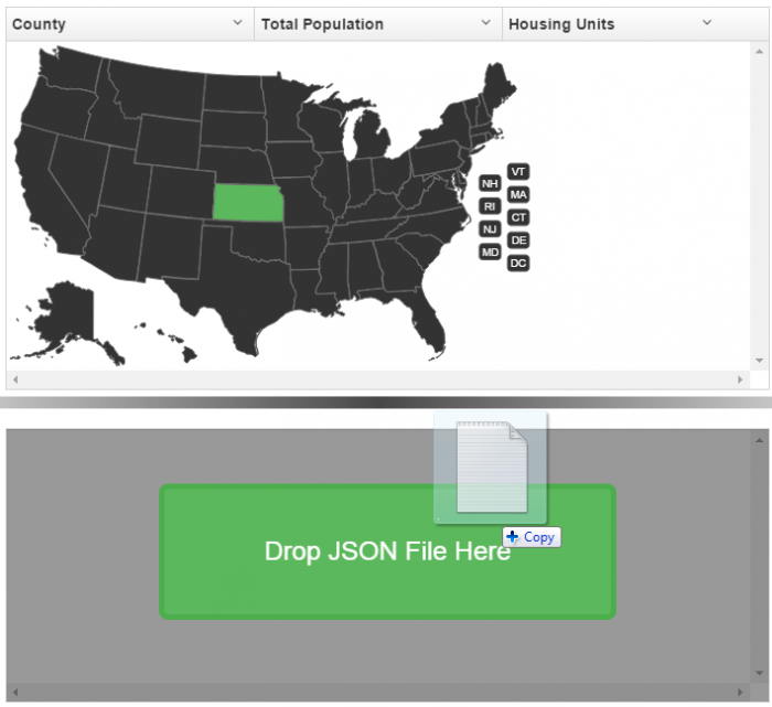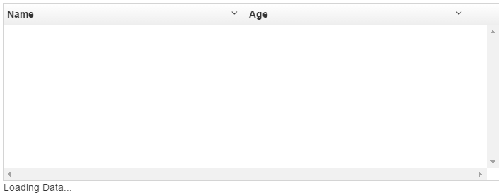
Currently UI-Grid doesn’t automatically show any messages when data is loading.
Nor does it show anything when there’s no data to show.
This can be a bit confusing for your end users as all they’ll see is an empty white space in the grid.
Luckily this is easy to fix with the most misunderstood feature of Angular 1.2: transclusion.
Angular is a Donut
Think of transclusion as a delicious jelly donut. UI-Grid is the donut and the functionality you want to add is the jelly. Is your functionality raspberry flavored? Never mind; don’t answer that.
In addition to simply being inside the donut and available for consumption, your jelly filling
has access to all the features and properties of the donut. Like the frosting or
sprinkles, if there are any. Alright so maybe the metaphor breaks down there. The point is that your
transcluded will have a scope that is a descended of your grid’s scope, so you can access the
grid property and all of its settings and data in your expressions.
What does transclusion look like? Not all that much:
|
1
2
3
|
<div
ui-grid="gridOptions" class="grid">
<div>I'm a special little transcluded div for grid {{ grid.id }}!</div>
</div>
|
The div inside your ui-grid element is what’s being transcluded. Pretty simple,
right?
Alright enough theory, let’s get started. You and I are going to look at two use cases:
- A “Loading…” message with a spinner indicator
- A “No Data” message
Loading Message
This message will be an overlay that will sit on top of the grid while your data is loading. The markup
is short and sweet, just a couple divs and your message. We will use an ng-hide on the
overlay that will only let it show if we are loading and have no data.
|
1
2
3
4
5
6
7
|
<div
ui-grid="gridOptions" class="grid">
<div class="no-data" ng-hide="gridOptions.data.length && !loading">
<div
class="msg">
<span>Loading Data...</span>
</div>
</div>
</div>
|
Our controller code is pretty short as well. We’ll make an init function that is
called when the controller starts up. That will set a loading flag on the scope, and then
unset it in our data fetch’s finally handler.
|
1
2
3
4
5
6
7
8
9
10
11
12
13
14
15
|
app.controller('MainCtrl',
function ($scope,
$http) {
$scope.gridOptions = {};
init();
function init()
{
$scope.loading = true;
$http.get('names.json')
.success(function
(data) {
$scope.gridOptions.data
= data;
})
.finally(function
() {
$scope.loading
= false;
})
}
});
|
Alright, if we fire this up what are we going to see?
Hmm, that’s not quite right. It looks like any content we transclude will just be appended to the grid element’s contents. I guess we’ll need some custom CSS to position it correctly and make it look nice. We want the overlay to:
- Overlay the entire grid
- Darken the grid a bit with some opacity
- Generally look nice
- Have an animated progress widget
Here’s the CSS for all that. Read the comments for what it all does.
|
1
2
3
4
5
6
7
8
9
10
11
12
13
14
15
16
17
18
19
20
21
22
23
24
25
26
27
28
29
30
31
32
33
34
35
36
37
38
39
40
41
42
43
44
45
|
/*
This is the background of our overlay. We need it to
be
absolutely positioned within the grid, and fill from
top to bottom, and the full width. It will also have
a black background with 40% opacity.
*/
.grid-msg-overlay {
position: absolute;
top: 0;
bottom: 0;
width: 100%;
background: rgba(0, 0, 0, 0.4);
}
/*
This guy will contain our message. We want it centered
so it's positioned absolutely with percentage-based
offsets and dimensions. It also has some basic border
stuff and most important is using "display: table" so
we can vertically center its contents.
*/
.grid-msg-overlay .msg {
opacity: 1;
position: absolute;
top: 20%;
left: 20%;
width: 60%;
height: 50%;
background-color: #eee;
border-radius: 4px;
border: 1px solid #555;
text-align: center;
font-size: 24px;
display: table;
}
/*
Lastly this is the actual message text. It uses
display: table-cell so the vertical alignment
works properly.
*/
.grid-msg-overlay .msg span {
display: table-cell;
vertical-align: middle;
}
|
Note on Vertical Centering: This is beyond the scope of this post, but there’s a bunch of different ways to vertically center elements. I’m using table CSS here, which might not be the best for you. Check out this Chris Coyier post for more.
Our result is much better! Let’s take a look at a demo of what we’ve just done:
OK, looking good. But what if nothing loads and our users are still staring at an empty grid? Since we’ve got Let’s add a “No Data” message.
No Data, No Problem
We already have the CSS set up so all we need is some markup:
|
1
2
3
4
5
6
7
8
9
10
11
12
|
<div
ui-grid="gridOptions" class="grid">
<div class="no-data" ng-hide="gridOptions.data.length && !loading">
<div
class="msg">
<span>Loading Data...</span>
</div>
</div>
<div class="no-data" ng-hide="!gridOptions.data.length && loadAttempted">
<div
class="msg">
<span>No Data</span>
</div>
</div>
</div>
|
Then we can add the loadAttempted flag to the finally handler:
|
1
2
3
4
|
.finally(function
() {
$scope.loading = false;
$scope.loadAttempted = true;
});
|
Here’s our resulting plunker:
Et voila! We are done. Transclusion is great for when you just want some simple extensions. Would you like more examples, such as:
- Selecting data for UI-Grid by selecting from a map of the US
- Loading message while using external paging
- Drag-and-drop file input for loading custom JSON data into grid
Enter your email below and I’ll send you a link to our bonus area where you can these uses cases for transclusion in UI-Grid, with example demos+code and explanatory documentation. Enjoy!

