In 6 Ways to Take Control of Displayed Data in UI Grid we looked at some common methods you can use to control how your data looks in UI-Grid. A grid is only as good as the control it gives over the data displayed in it, and the goal of UI-Grid is definitely to give you as much control as possible.
In this post we are going to look at a couple more tricks that will get you closer to the goal of perfect customization
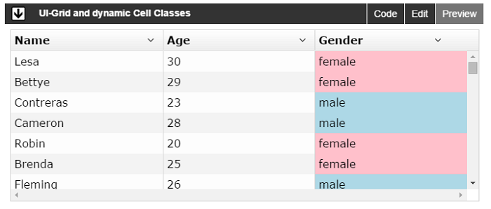
Dynamic Cell Classes
When you specify your grid’s columnDefs you can give each column a
cellClass. This can either be a string, or in the case we’re going to look at: a
function. The function will receive the grid, row, column, and row and column indexes as arguments. You
just return the appropriate class name
Here’s an example:
|
1
2
3
4
5
6
7
8
9
10
11
12
13
|
$scope.gridOptions
= {
enableSorting: true,
columnDefs: [
{ field: 'name' },
{ field: 'gender',
cellClass:
function(grid,
row, col, rowRenderIndex, colRenderIndex) {
if (grid.getCellValue(row
,col).toLowerCase() === 'male')
{
return 'red';
}
}
}
]
};
|
You don’t have to worry about figuring out your binding if you have a complicated one. The
Grid provides a getCellValue() function. If you pass the row and column in it
will return the value for that row+col combination.
Be aware that each grid cell has its background color set with a class definition that looks like this:
.ui-grid-row:nth-child(odd) .ui-grid-cell. If you give your grid a custom class, like
.grid you can just define your custom cell class as
.grid .ui-grid-row .ui-grid-cell which will raise its CSS specificity enough to take
over.
Lastly here’s a plunker that demonstrates what this looks like: