Getting your data displayed just right in UI Grid can be a huge pain.
You might just want to format some numbers, or you might want to embed something complex like a chart or custom directive.
In this post outline six (plus one) different methods you can use to get your data just the way you want it:
- Bindings
- Update: Cell Classes
- Cell Filters
- Cell Templates
- Links
- Buttons
- Custom directives
Bindings
UI Grid columns can be bound to any sort of Angular expression, as well as property names that would normally break an expression:
|
1
2
3
4
5
6
7
8
9
10
11
12
13
14
15
16
|
var columnDefs = [
{ field:
'name' },
{ field:
'addresses[0][0][1]'
},
/*
Yes, you
can use hyphens, plus signs, etc.
Normally
something like {{ row.entity.first-name }} would
bomb but
UI Grid pre-processes your bindings to make sure they work correctly.
*/
{ field:
'first-name' },
/* Function expressions work too */
{ field:
'getCurrency()' },
{ field:
'transformValue(row.entity.myField)' },
];
|
Cell Classes
When you specify your grid’s columnDefs you can specify a CSS class for that column with
the cellClass property. The simplest type is a just a string representing the CSS class
name, though you can also specify a
function if you want dynamic control.
|
1
2
3
4
|
var columnDefs = [
{ field:
'name' },
{ field:
'address', cellClass: 'address' }
];
|
Cell Filters
Cell filters can transform the displayed value for a column while leaving the model intact. In this
plunker the amount column contains floating point values, but we only want to display the integer part.
A simple cellFilter that uses .toFixed() will alter the displayed value the way we want.
Passing Arguments
In the third column I am using two different fields. The column itself is bound to the same field as
the second column, but on the filter I am passing the scope like so:
cellFilter: 'currencyFilter:this'. Using the this argument on your filter will
pass the scope.
Then I can lookup the currency symbol I want using the currency field from the row.
If you double-click a cell in the Currency column you’ll see that the raw value is still available to be edited. Cell filters only change your displayed value!
Cell Templates
Column definitions take a cellTemplate argument you can use to give your cells a custom
template. You can specify it a few different ways, with a url (relative or absolute), an Angular
template ID, a string/Angular element, or a promise.
|
1
2
3
4
5
|
var columnDefs = [
{ field: 'name',
cellTemplate: 'name-template.html' },
{ field: 'name',
cellTemplate: 'myTemplateId' },
{ field: 'name',
cellTemplate: $.get('url-to-your-template.html') }
];
|
Bindings in Cell Templates
There are a couple options for your binding your row’s data in your template. You can access the
row object which is in the local scope; row.entity will contain the reference
to your object, so if you want the “name” field, you can bind like so:
{{ row.entity.name }}.
If you’ve already defined your binding in your column definition you can use one of UI
Grid’s placeholders: {{ COL_FIELD }}. UI Grid will automatically replace COL_FIELD
with the appropriate binding. If you need to two-way bind to your row, like when you’re using the
edit feature, you’ll need to use the MODEL_COL_FIELD placeholder.
|
1
2
3
4
5
6
|
var columnDefs = [
{
field: 'image_url',
cellTemplate:
'<div class="ui-grid-cell-contents"><img src="{{
COL_FIELD }}" /></div>'
}
];
|
Links and Buttons
Links are simple, just use regular old HTML. Wrapping your cell in an element using the class
.ui-grid-cell-contents will apply the proper CSS settings like padding, overflow, etc., and
make sure your cell fits in its space nicely.
|
1
2
3
4
5
6
|
var columnDefs = [
{
field: 'email',
cellTemplate:
'<div class="ui-grid-cell-contents"><a
href="mailto:{{ COL_FIELD }}">Send E-Mail</a></div>'
}
];
|
In the plunker below I’m using a basic cellTemplate to bind both the first and last name fields into one column. On the second column I’m using a simple link like above (note: none of these emails are real).
On the third one, I’m using a template that’s referenced in index.html. If you check the
bottom of that file you’ll see the template inside a
<script type="text/ng-template"> tag. Any tags of that type will put
automatically put into the template cache ($templateCache) by Angular, with the id you
specify.
Also in the third column template you can see I’m using a variable called
grid.appScope. Anywhere in your templates, grid.appScope will be bound to the
parent scope of your grid. I use it to bind my button to a function in my controller that will open a
new window with a url to google maps with the address in it (note: most if not all of these address will
not exist).
Tooltips
Tooltips like those from UI Bootstrap are a
little bit different because they float over your content. By default the grid’s cells are set to
hide any overflow, so if you just pop a tooltip in there it won’t show up and you’ll
probably be very confused. You can solve this by either adding some custom overflow CSS to your
cellTemplate, or if you’re using UI Bootstrap you can add
tooltip-append-to-body="true" to the element with your tooltip and the tooltip will be
appended to the body and absolutely positioned where it needs to be.
Hover over the names in the plunker below to see tooltips with overflow CSS; the third column uses the append-to-body method:
Tooltips cannot overflow beyond the constraints of the viewport, so they won’t show above the first row or below the bottom row, for example.
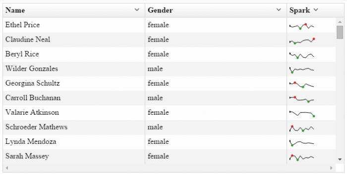
Custom Directives
You can put absolutely anything in your cell templates, just remember to use
.ui-grid-cell-contents if you’re not applying your own custom cell CSS.
Here I’ve used d3.js, nvd3.js, and angular-nvd3.js to create sparkline charts in my cells.
Summin’ it up
You should be able to do the vast majority of what you want with your data using these six methods. If you have questions, suggestions, or just want to say hi, drop in to our gitter channel we’d love to meet you!
If you want some help navigating through these different customization methods, enter your email below to get a flowchart PDF showing you which method to choose for a given need.